Whenever dealing with new datasets, or when putting together a summary for stakeholders, we often encounter the problem of having to represent our data in a meaningful and efficient way. Meaningful such that conclusions and comparisons can be drawn from our plots, efficiently such that few plots are necessary.
Today we are going to peek into the world of non-parametric representations, concluding with an enhanced boxplot as the best solution to convey information in the least amount of space. For the sake of brevity, we will assume certain knowledge on the reader’s side (although references are indicated for anyone who feels like refreshing).
Let’s go!
Stylized Facts About Distributions
When it comes to data distribution, there are several stylized facts that should be easy to spot in a plot:
- central tendency (if any) around a given value;
- dispersion (or scale);
- tail-behavior: extreme values (genuine observations from the same distribution as the bulk) and outliers (observations drawn from another distribution).
Whichever plot we use, statistically-untrained readers should quickly grasp the basic distributional information of the data.
For today’s showcase, we are going to use four different distributions of daily returns:
- no central tendency: Uniform;
- existing central tendency: Normal;
- skewness: skew normal distribution [1];
- unknown distribution: Petroleum daily returns (5y ~ 1300 samples);
so that we are able to see how the different properties of these distributions are reflected in the plots.
Usual Representations
If you asked around, what kind of plots would people suggest for you to show your data? The following ones are likely to show up:
- Histogram;
- Kernel Density Estimate (KDEs) [2];
- Empirical Cumulative Distribution Function (eCDF).


We have plotted our test distributions under those frames. We can see the expected shapes come up, but beware, there are some hidden problems.
On the one hand, to generate the histogram and the KDE, we had to set the value of a parameter:
- Histograms: bin size / number of bins;
- Kernel Density Estimates: kernel shape and bandwidth (smoothing) parameters; changing them can lead to different plots for the same data [3].
On the other hand, the eCDF is parameter-free [4], but it requires some statistical training: it does not provide an intuitive comparison between datasets, nor a straightforward visualization of the data distribution (could you spot a central tendency in it or measure dispersion?).
“As an initial exploratory visualization tool, this dependence on multiple tuning parameters is less than desirable.”
Source: [5]
Nonparametric Numbers
To overcome the aforementioned difficulties, we can fallback to what is known as the seven-number summary: a collection of sample percentiles which convey information about the central tendency, dispersion and shape of the distribution (kurtosis, skewness). Percentiles belong to so-called robust statistics, since they have a non-zero breakdown point [6].

These percentiles have been chosen wisely: if the underlying distribution is normally distributed, they will be equally spaced. Hence, this table not only gives the reader a quick grasp of the sample typical values, but it also provides some understanding of the underlying distribution, by how much it differs with respect to a normal distribution.

Tukey’s Boxplot
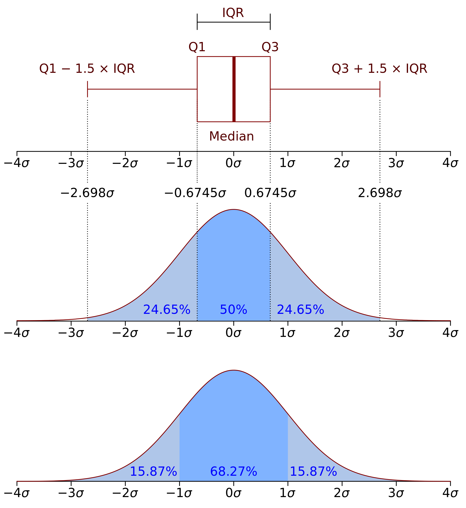
This table can be represented in what is called a boxplot [8]. Boxplots can be built in a variety of ways, especially when it comes to whisker location. Tukey was the first researcher to publish data with this format [9]. At a glance, one can see any central tendency (median, horizontal bar inside the box), dispersion (interquartile range [IQR], upper and lower sides of the box), and any outstanding data beyond the upper and lower whiskers.

Whisker Location
Tukey decided to place the whiskers at a distance 1.5 x IQR with respect to the upper and lower quartiles. If the distribution is normally distributed, this will lead to 0.7% of the samples to be plotted as individual outliers.
When he first introduced this plot, he was asked about the 1.5 coefficient. Reportedly, his answer was:
“Two seems like too much and one seems like not enough.”
Source: [7]
Boxplot Pros and Cons
The boxplot is a great tool to convey information to the untrained eye. One can establish effective comparisons between datasets and get a quick feel of the central tendency and the dispersion of the data.
Its main drawback is the location of the whiskers, which is somehow arbitrary; we could have well chosen any other value (such as 2%-98% percentiles) to place them. Because of this, we cannot immediately interpret a box plot without finding in the text this definition.
Enhanced Boxplot
To get around this issue, we can use the so-called letter-value plots [5] (or enhanced boxplots in Seaborn [10]). In their paper [5], they use the nomenclature «letter-value» to reference standard percentiles such as the quartiles, the deciles, etc.


These plots give visibility into a wider depth of the distribution’s percentiles, thus providing more information about tail-behaviour. And yet, it remains an aesthetic, easy to read plot with the same information as the boxplot.
For instance, for the financial distribution of returns, on the traditional boxplot (left) many of them are tagged as outstanding. However, on the enhanced boxplot (right), only a few are tagged as outstanding, the others belonging to the tail (but not necessarily outlier samples drawn from a different distribution).
The last percentile to be drawn as a box (and thus marking the limit from which samples are drawn as individual points) is determined according to the confidence the samples give to each letter-value [5, Section 4].
Conclusions
Enhanced box plots are superior to traditional boxplots in that they provide more detailed information about tail-behaviour, whilst keeping the interpretation simple for the untrained eye (such as business-role colleagues or non-technical stakeholders).
Compared to other representations, they are:
- Out-of-the-box: parameter-free construction.
- Meaningful: a lot of information is compressed (central tendency, dispersion, tail behaviour).
- Efficient: one plot suffices.
Naturally, by no means we are disregarding the use of other representation possibilities, each plot has its advantages and drawbacks. However, the others require a deeper understanding of statistics or do not provide (to our understanding) such a neat comparison between datasets.
What is your view on the matter?
Thanks for reading!
Sources
[1] Skew normal distribution – Wikipedia
[2] Kernel density estimation – Wikipedia
[3] The importance of kernel density estimation bandwidth | Andrey Akinshin
[4] Empirical distribution function – Wikipedia
[5] Letter-value plots: Boxplots for large data
[6] Robust statistics – Wikipedia
[7] https://math.stackexchange.com/a/3576656
[8] Box plot – Wikipedia
[9] Variations of Box Plots
[10] seaborn.boxenplot — seaborn 0.11.2 documentation